
Nynke
Senior Project Manager
Nynke is our Senior Project Manager. Originally from the Netherlands, she joined us in 2017 and has been the glue that holds us all together ever since! She originally studied Philosophy, but has been working as a Project Manager for 5 years now. She is a talented baker, a keen boardgamer, and is a Tetris champion!Nynke's work
- Portfolio
- In Progress
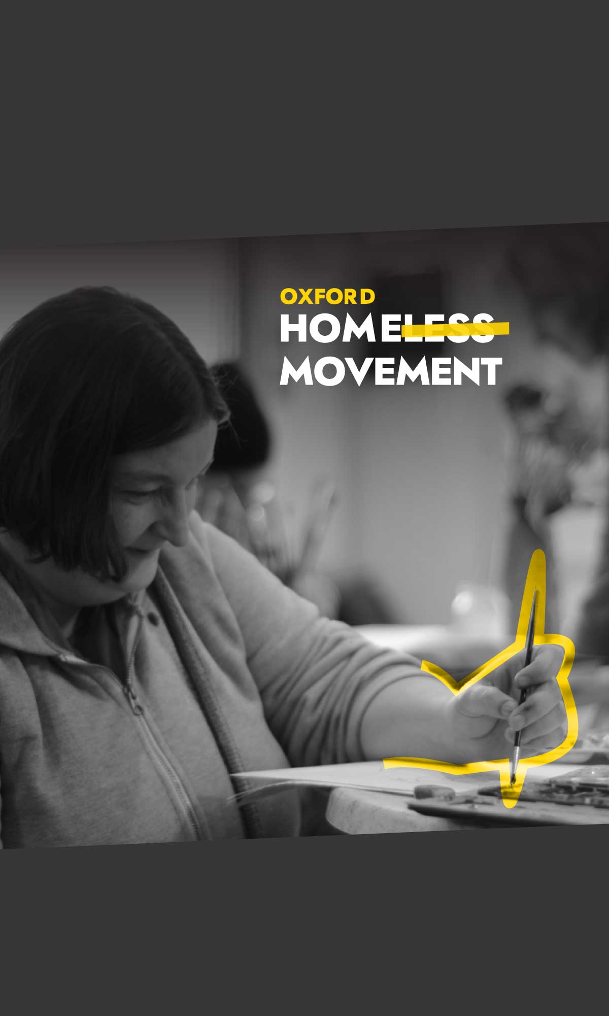
Oxford Homeless Movement
A brand and website to unify destinations and services for people seeking information on homelessness intervention in Oxford.
View portfolio2 rounds Series A funding from Parkwalk and OSI
OU IT Innovation Seed Fund
OU Teaching Project Award
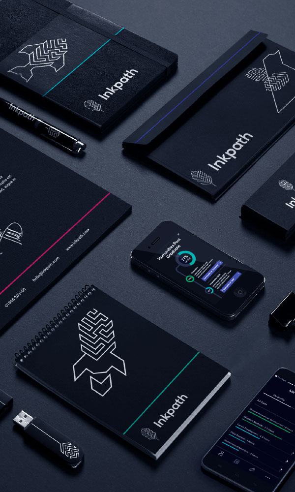
Inkpath
For this Oxford University spin-out, we branded, designed and built a tool to help academics record and plan their career pathway.
View portfolio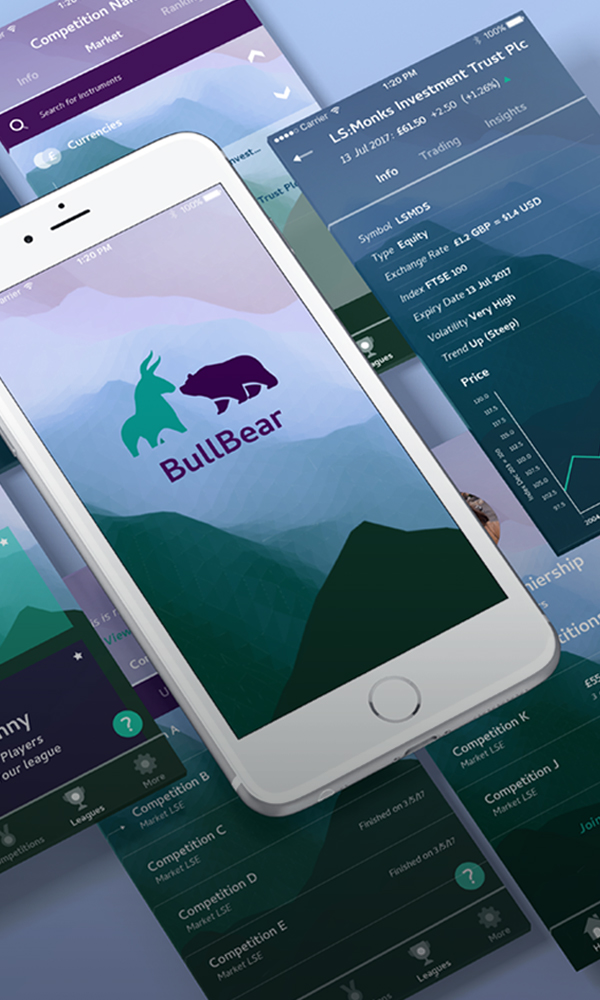
BullBear App Design & Build
The world of stocks and shares can be an intimidating venture: an industry filled with anagrams, colloquial terms, and jargon. The barriers to entry seem impossibly high to many armchair investors.
View portfolio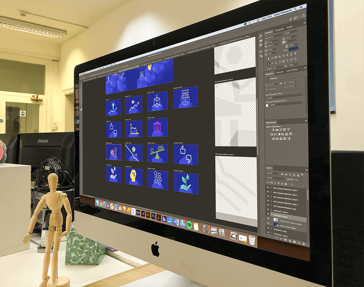
Illustrations for the Insitute for New Economic Thinking.
William Green Architects Branding and Website Design
KUPU is a platform designed to promote awareness of holistic therapies and their benefits.
INET
We were asked to design nine icons to represent INET's nine main research themes. The challenge was to bring nine very different ecumenic themes together and incorporate them under one style that was recognisable and yet distinguishable. Alongside the main themes, we were also asked to design icons for the 5 programme teams including ‘Complexity Economics’, ‘Economics of Sustainability (EOS)’ and 'Ethics and Economics’. With such challenging and abstract imagery to work with, it took time to narrow down the essentials of each theme and what was really needed to communicate the meaning.
William Green Architects
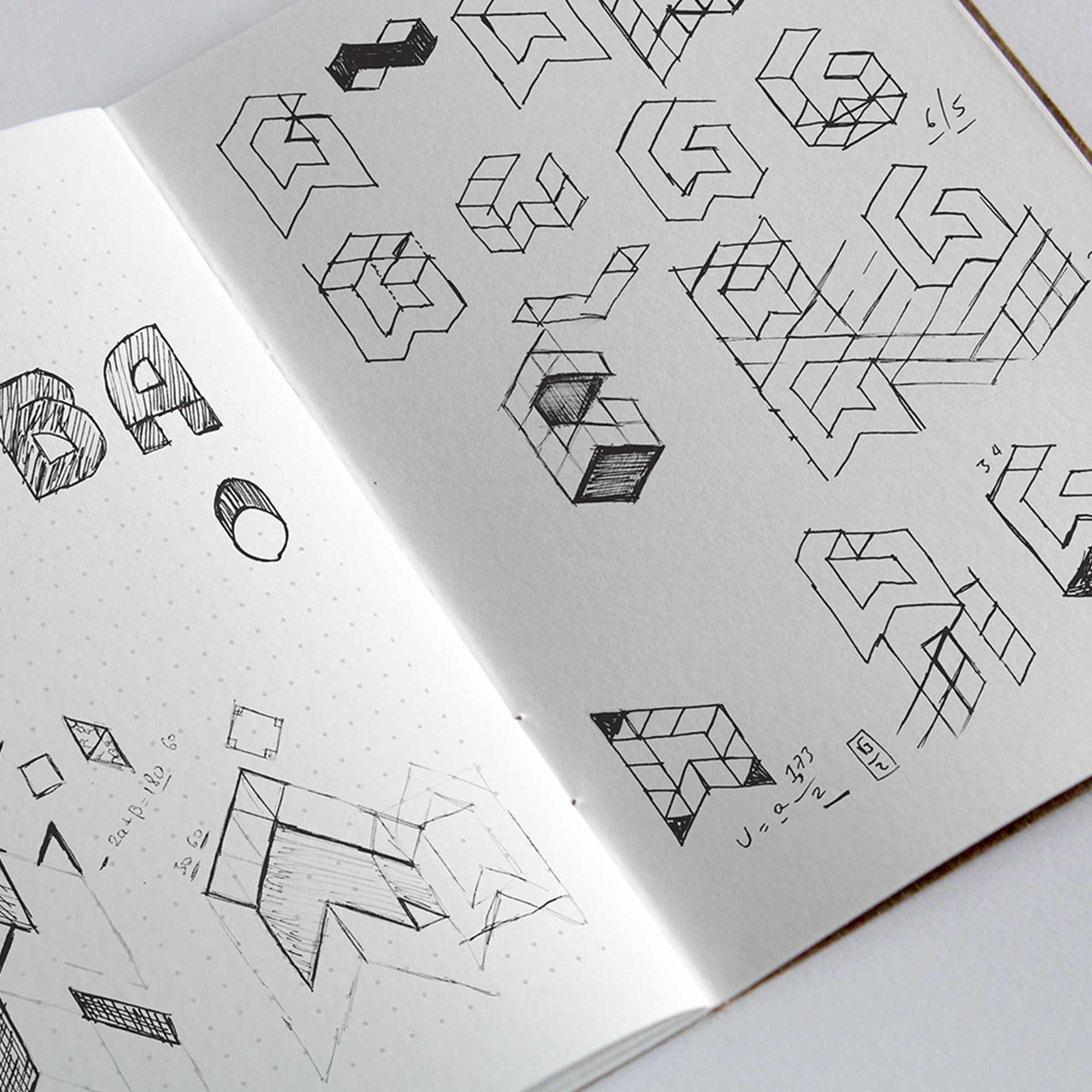
One of the key principles William green wanted to portray in the new branding was excitement. WGA pride themselves on their absolute passion for design and this was fundemental to the new website. It had to be clean in function with simple, intuitive navigation. The branding had to stand out above the white noise of other architecture firms as potential clients will browse numerous architecture firm websites before deciding and so the design of the website needed to ensure that WGA was notably remembered.
KUPU Branding
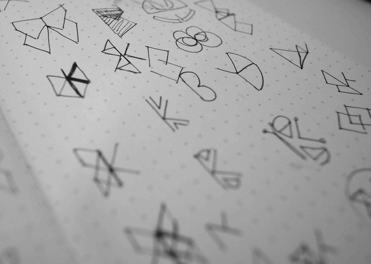
KUPU is a platform designed to promote awareness of holistic therapies and their benefits, and book these therapies through an app. The brief was clear: The branding should be gender neutral, modern and strong. With competitive companies in the midst, the look and feel of the brand should be distinctive, bold and original. The name of the platform ‘Kupu’ means butterfly in Indonesian, and so this gave us a good starting point in terms of imagery. With the brief being very clear in aiming towards a gender neutral feel, we had to be abstract in our approach.
