

Tamarindo Communications
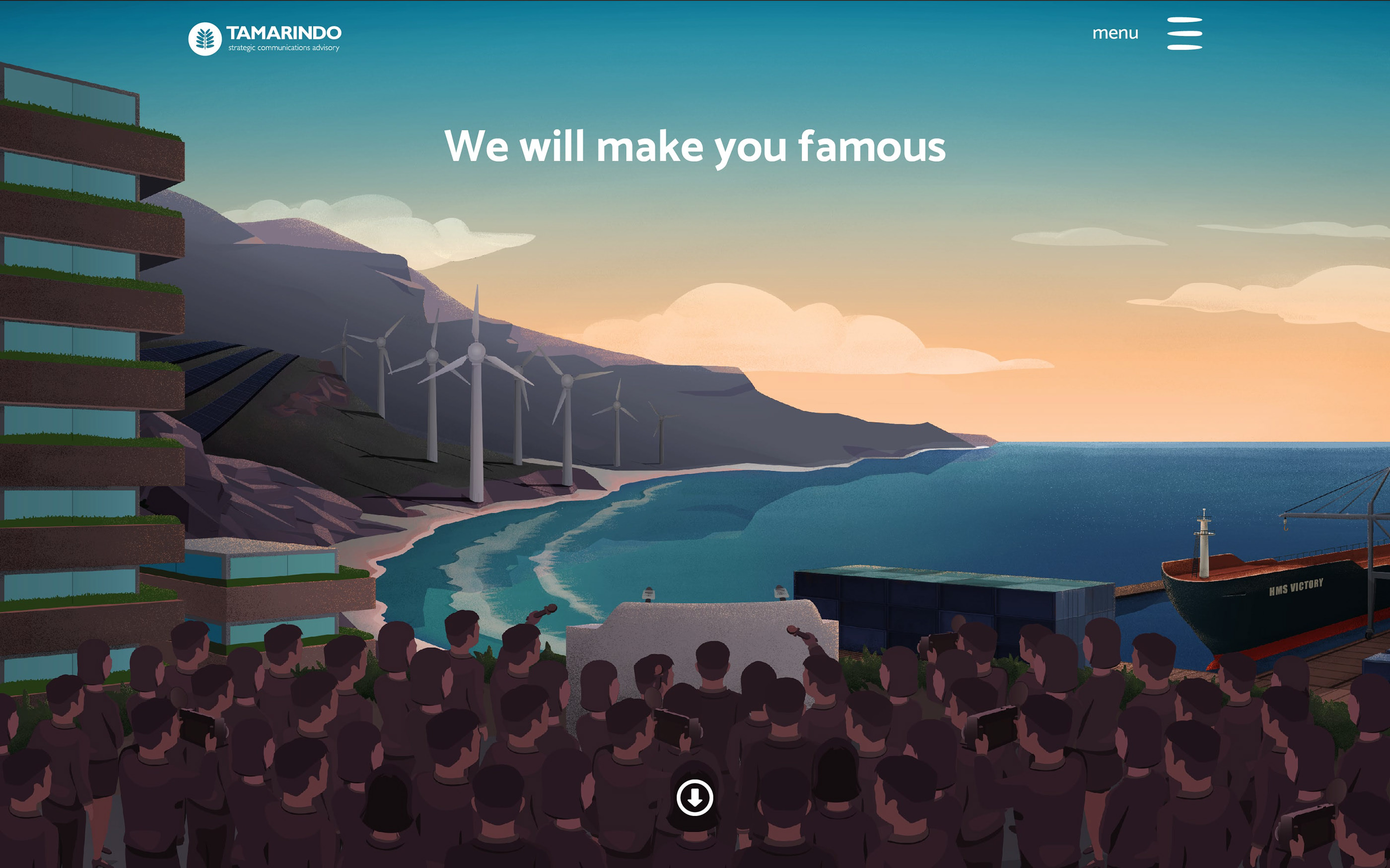
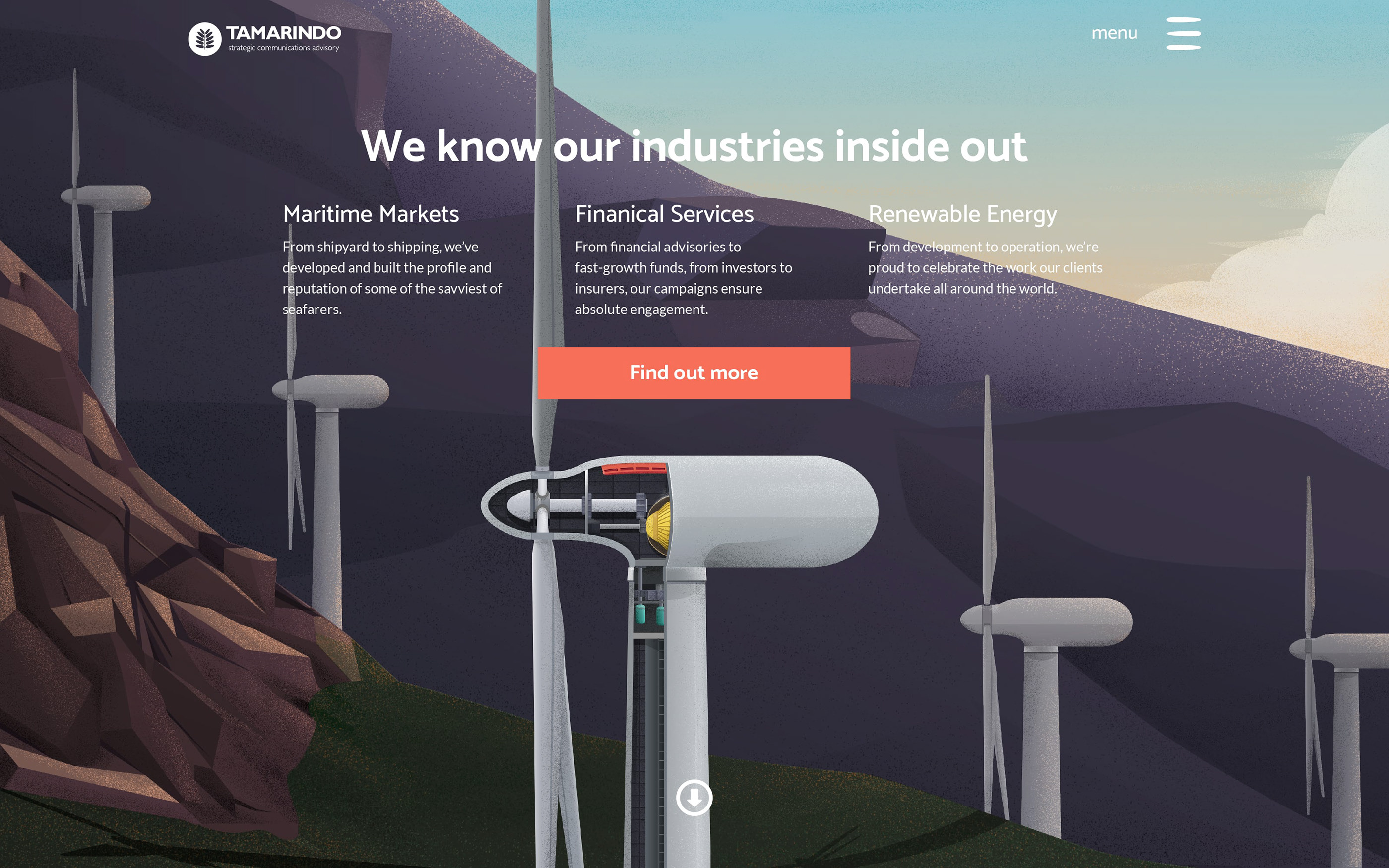
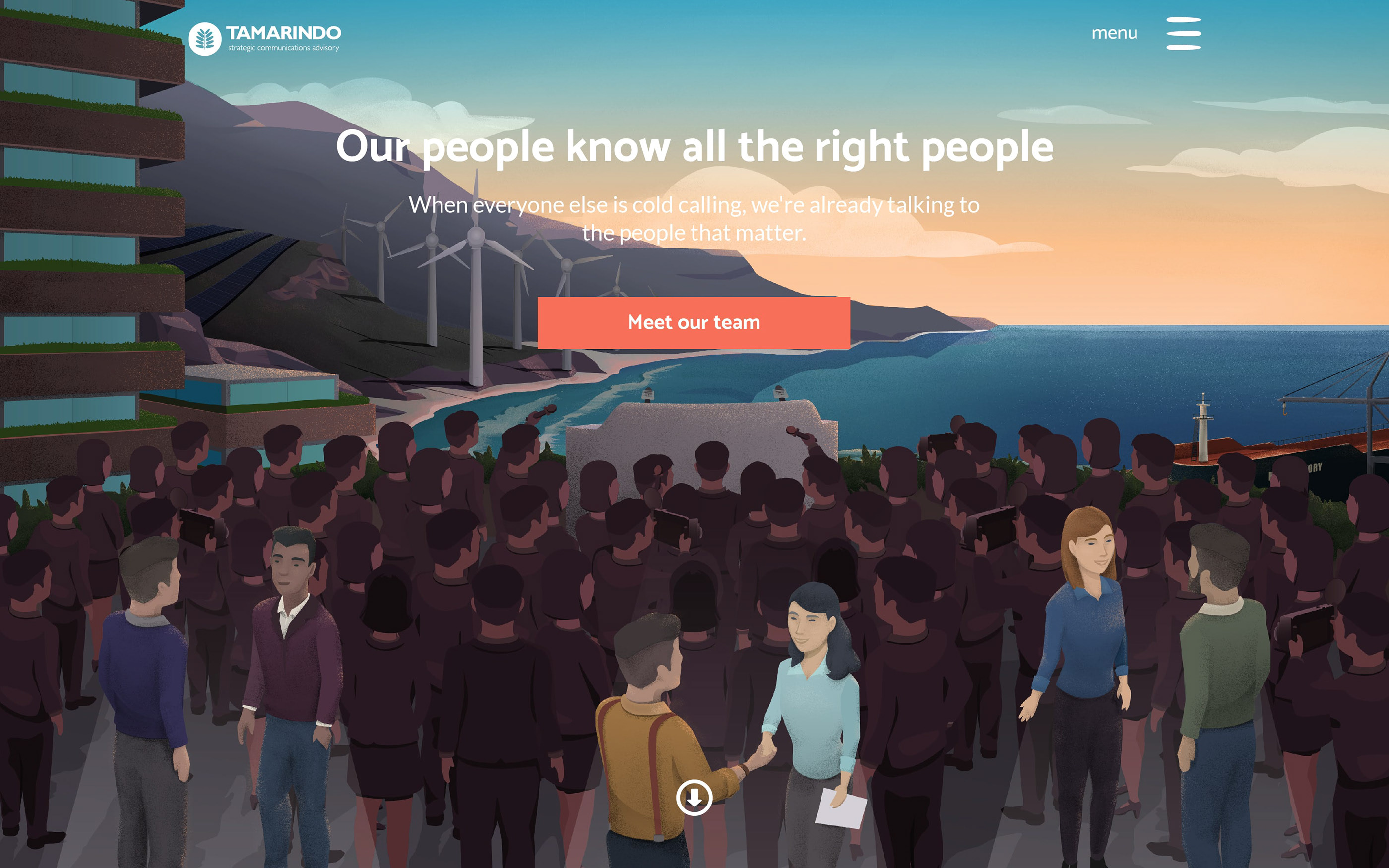
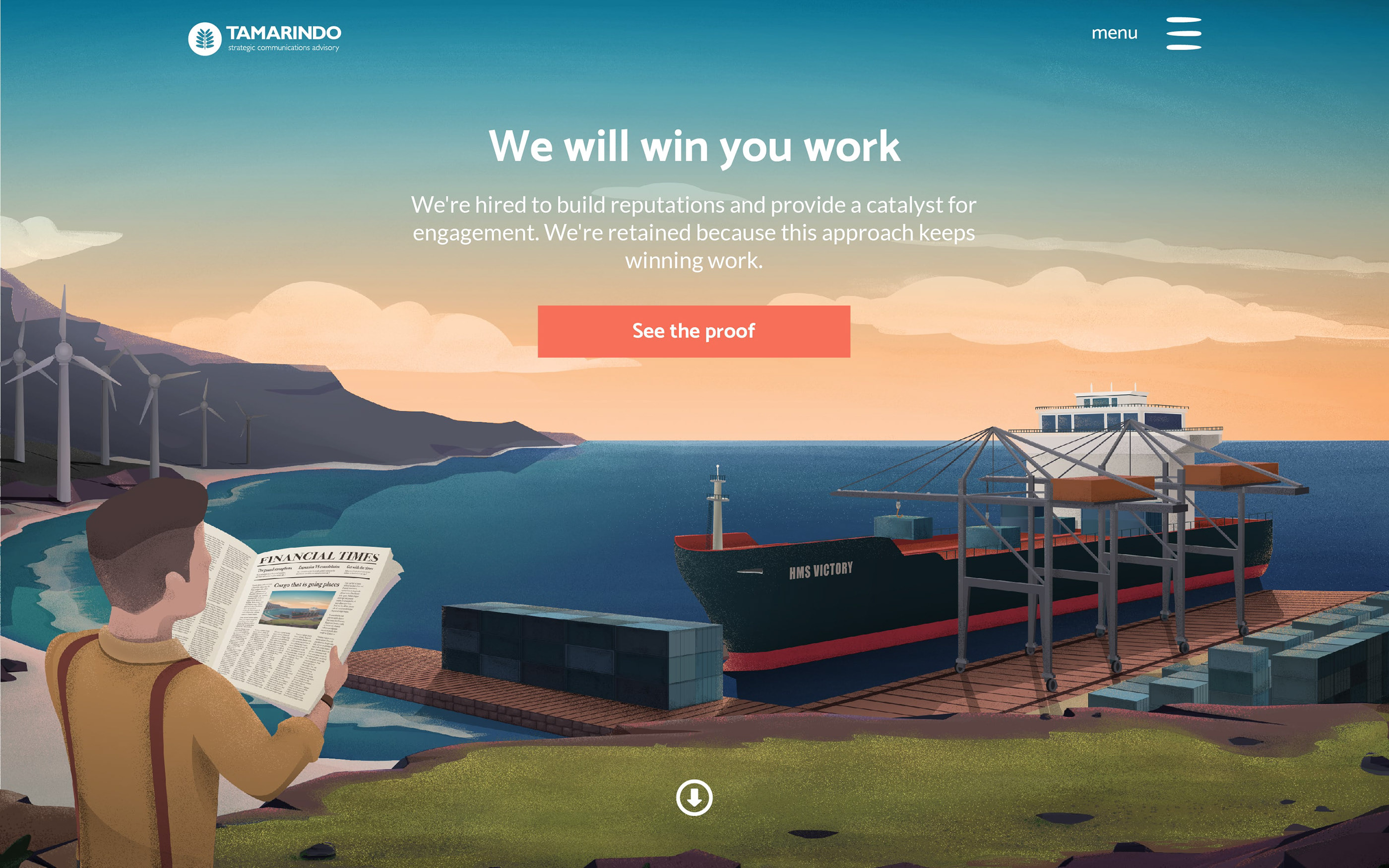
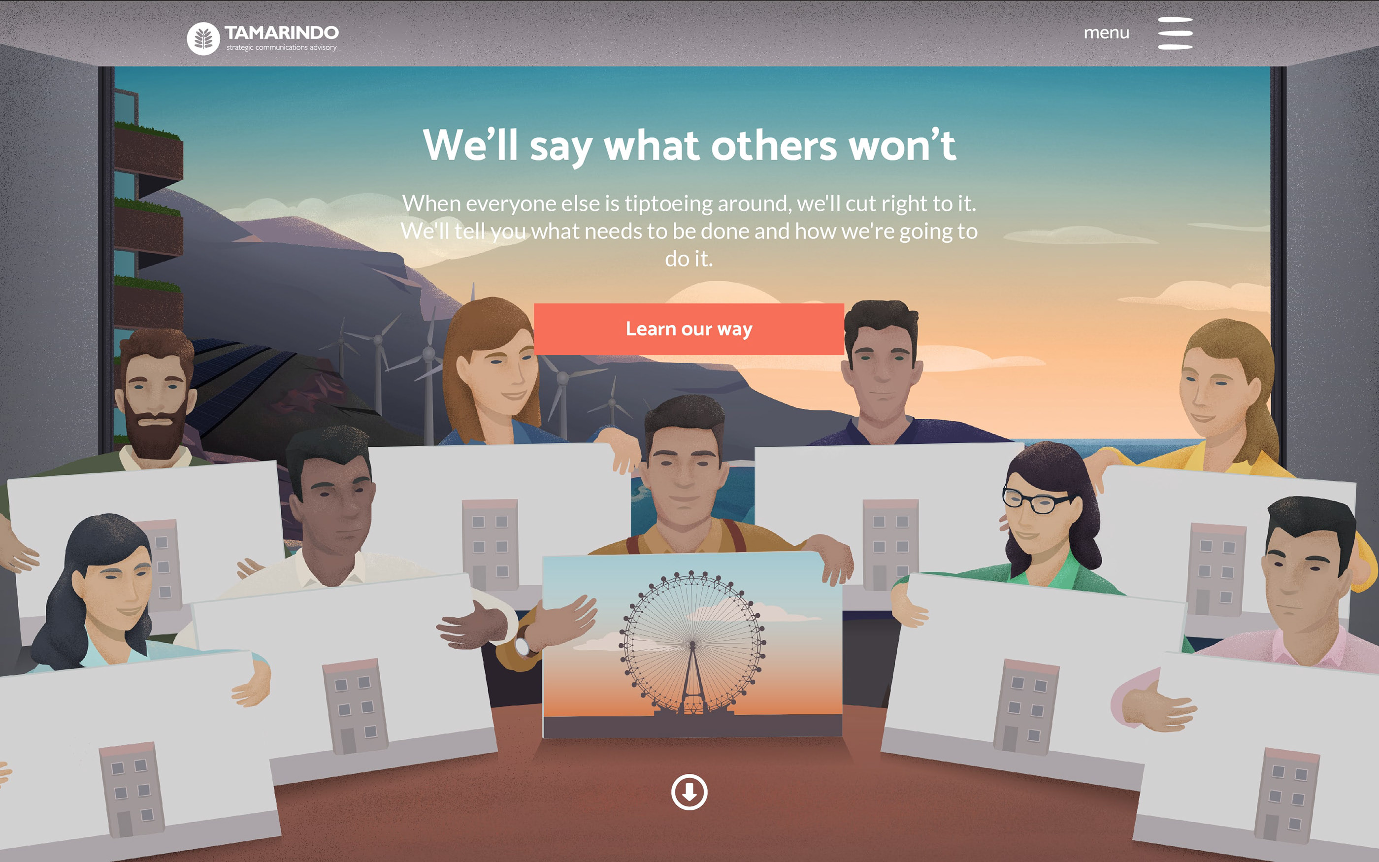
The challenge we faced was this: all PR agency websites look the same. There is belief in the community that this stems from an expectation for a certain look, feel, and culture. We don’t necessarily agree with this philosophy. Our charge was to make a site that was obviously a professional outfit, but that cuts a different line: an agency that stands out from the crowd and, in so doing, implies they can do the same for their clients.
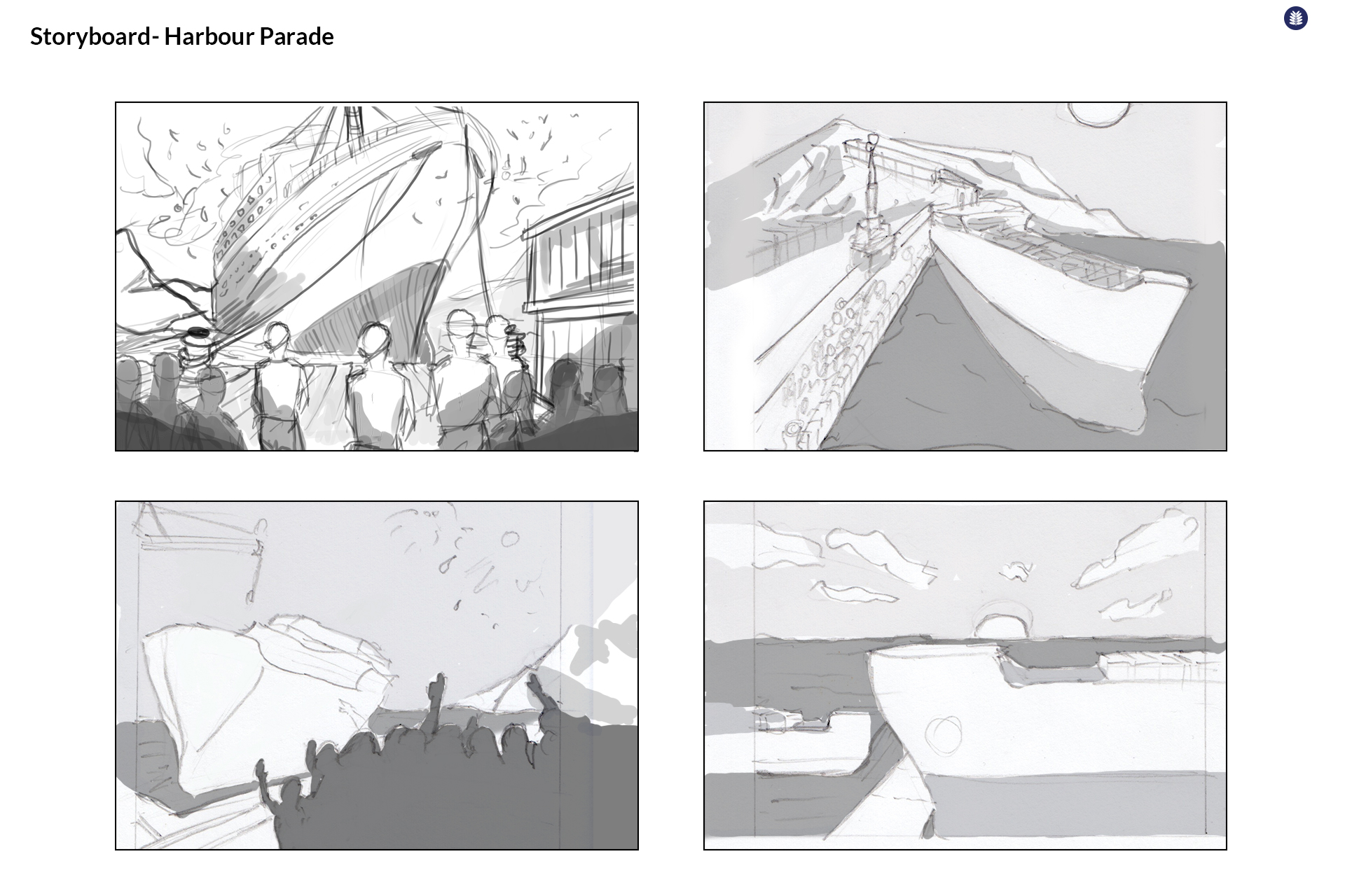
The illustrations were hand drawn by our in-house illustrator, Ben. The site inner pages were meticulously wireframed and designed by our design team for the development team to put together with their web glue.
It’s pretty, impactful, and powerful. It runs on a Drupal content management system built and configured specifically for the client’s changing needs over the next few years.



You may also be interested in…
Winner: awwwards Mobile Excellence Award
William Green Architects
After reconsidering their business and marketing strategy, William Green Architects came to us with a challenge.
View portfolio
Blue Sun Luxury Yachts
Responsive website design and build, with various web service integrations.
View portfolioPublished in Nature Genetics
GWAS Diversity Monitor
A live, dynamic infographic for a research paper published in Nature Genetics, outlining the ethnic diversity of research participants in genetic discovery research globally.
View portfolio
