As with any web professional, I give advice on the reasons behind why we do things in a certain way. Some of this advice comes from experience and some from user research, but a lot of it can be found in the annals of psychology. We use terms like “navigational trauma” and “perceived control” but never really have the chance to explain them.
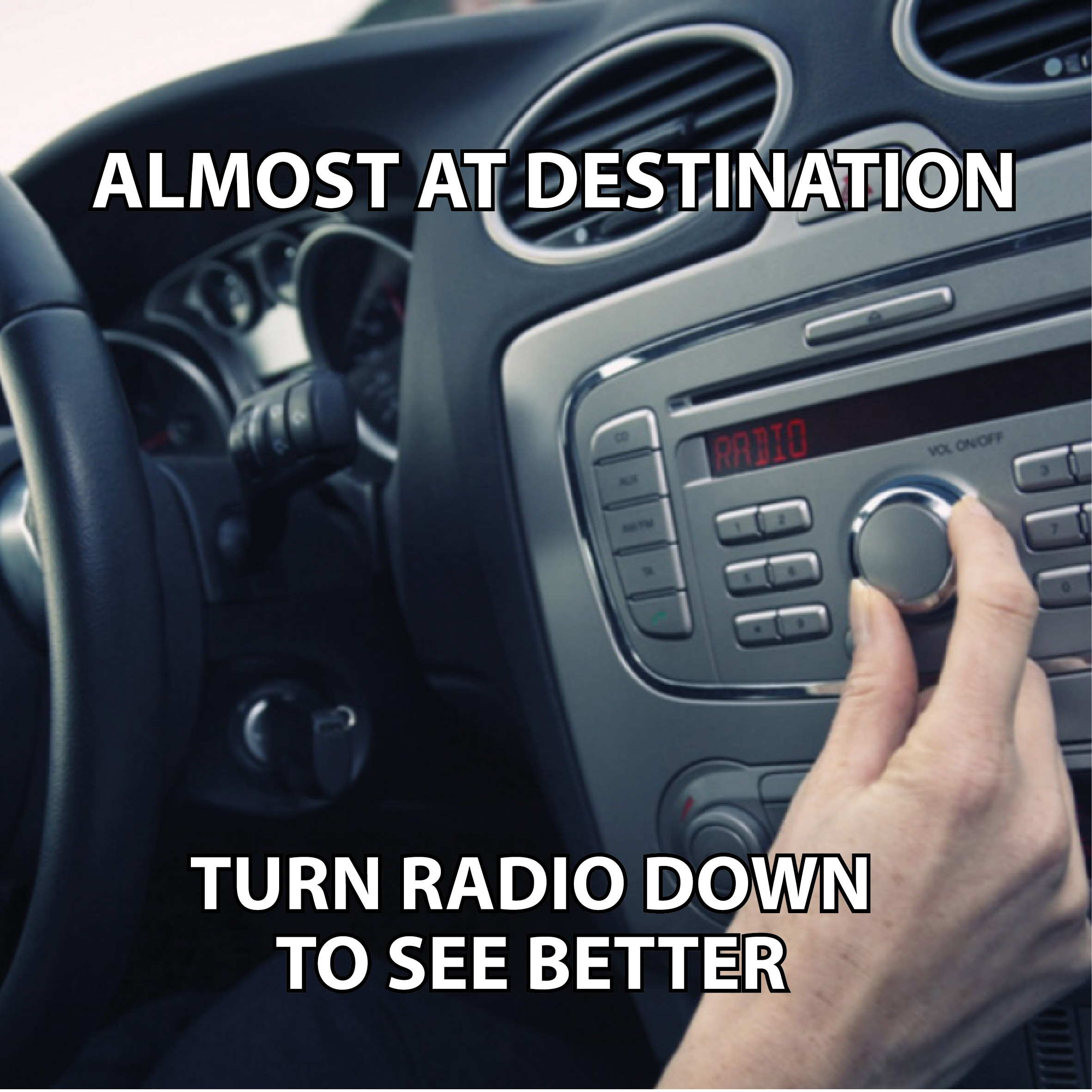
So I thought I would write a few short articles themed around "Web Psych 101" exploring these and perhaps even debunking some. Let’s start with an oft-cited phenomenon surrounding the choices you present your end user. Forgive the meme above but we’ve all done it and the question is "why?". It turns out your brain actually has a RAM analogue; short term memory for the things your attention is on right now. It keeps referring back to longer term memories but when you give it more things to concentrate on, it has to flush some items it’s holding.
This is why you forget that important question you had to ask during a meeting. Worst of all, your brain has a mechanism that makes you believe you’ll never forget that new information and yet... Wait, what has driving got to do with websites? Many of us will have said to our clients “don’t put too many options on the page/screen/view/menu” and here comes the science part. Miller’s Law - or, as his 1956 paper was called, “The Magical Number Seven, Plus or Minus Two” - describes this psychological phenomenon. Our short term memory’s optimum capacity is just seven objects.
So, next time you tell a client that you should only have up to* seven options presented to a user, now you can explain why. *Look out for a forthcoming article on Hick’s Law and why it’s important to limit choice.


