Ben
DeveloperIn this blog I will explain our process of approach for the design of some recent work we have produced for Tamarindo.
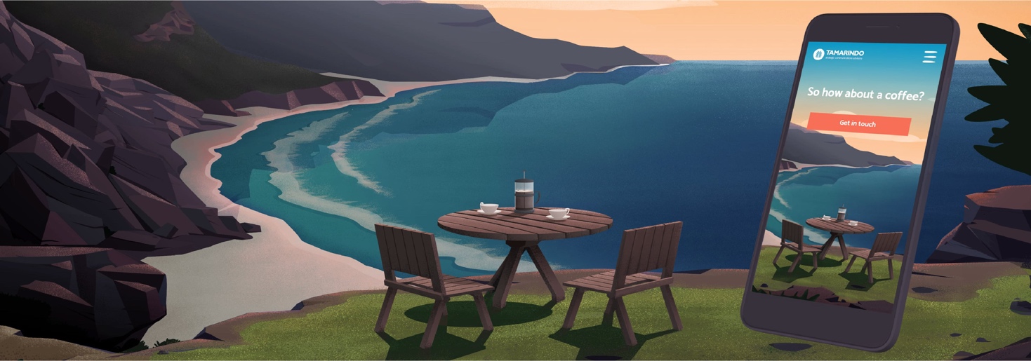
When preparing to work on a digital project with heavy illustrative influence, it is vital that the team has a firm grasp of the outcome and purpose of the design. Defining and nurturing the idea is absolutely key here. Our client told us his wonderful origin story: inspiration came to him as he was sipping coffee on the beaches of Tamarindo, Costa Rica. We were enthused by this story, aiming to use it as the centrepiece for our ideas when we were storyboarding the concepts and mapping project requirements. Our aim: to replicate that feeling and moment in time for visitors to the website.
The approach to this project started as most creative projects should. There are exceptions to this, and design decisions to keep in mind that I will explain. The first step in any project is to ensure we can meet our client brief and address key pain points of the audience. To do this we need to be sure that the artwork, concept and wording will tell the story from our audience’s point of view.
We whittled our ideas down to six key steps that would answer our audience’s questions and tell the story at the same time. To begin, the user would arrive on our homepage in reverse perspective; seeing the end product of their success, later unravelling the process.

From here we decide and organise our limitations for web platforms, make decisions involving browser compatibility, responsive behaviours and any animation or micro interactions. These decisions have an impact on the design approach, image sizing and flexibility. It can also dictate what software is needed to achieve the look we want.
Keeping in mind the decisions we made earlier in our ideation process, I began constructing foundations for the creative direction of this project with a mood board. This mood board can contain anything necessary to the project. However I recommend including images of places of inspiration, design styles and textures. Try to include as few illustrated examples as this will influence your design decisions; often leading away from the original stylistic choice. The nostalgic elements of this story provided the creative direction I needed for our theme, replicating and conveying a vintage and idealistic colour scheme and texture. The next step was to ensure I could emulate this nostalgic, retro feeling in the proportions, perspective and layout of the illustration; I decided on a view point and created a template which would dictate the perspective of each illustration.

The most arduous but exciting part of the process was to illustrate those six key steps we outlined. During this process I am constantly checking that I answer the brief and am conveying a relatable and consistent message. Constantly reflecting the design style whilst answering the layout needs (ie perspective and proportions). I ensure I leave room to consider movement, both visual positive and negative space, as well as animated parallax or other specified in the brief. I ensure that I can prepare an art file that is flexible to the needs of the project; in this case designing for responsiveness, multiple levels of parallax and scaling for printed format. To do this, I created a tonal vector drawing in Adobe Illustrator which could be updated and edited (as a smart object in Adobe Photoshop) as needed for specific view points on browser or flexibility between the Illustrated steps. In doing this I can avoid the complication of colour until I have the composition, tone and texture correct. I finalised the imagery by overlaying painted colour and texture for each parallax layer (feature, foreground and middle-ground) in Photoshop. I have greater control over colour variation and depth of texture this way. The images are painted at full resolution, suitable for web, so scale is not an issue for the majority of assets. We have exceptions here, such as .svg components for menu items and footers, which are instead coloured in Illustrator.

The final step is another exception to the usual design process; we take on the illustrations. Once images are finalised and separated into their respective layers, we optimise the imagery as per the instruction and advice of our development team, taking into consideration progressive image loading, colour profiles, and relevant image size.
The tools we use are part of the GNU toolchain and other similar OSS groups/foundations. Primarily, we try to use ImageMagick's `convert` and `mogrify` programmes/commands, as well as pngquant and SVGOptim [web-app by a Google dev.]
Between these four, one can handle optimisations for SVGs, PNGs (both lossy and lossless; retaining alpha channels and squashing them) and JPEGs, whilst also outputting posterised images to minimise the number of colour channels required, greatly reducing the file size.
Additionally, they can be output in resized formats and encode progressive and interlaced loading into the images, to prioritise Adam7 interlacing block pattern ordering, or prioritise by colour channel (greyscale first, slowly adding greater accuracy in layers of colour), until fully loaded.

I hope this article has shed light on the process of creating high-end illustrative, flexible artworks. We have ensured, through effective visual storytelling, that the client brief was met and answered effectively. We have produced this product with longevity for scaling with the client, and we have integrated this artwork into the medium of digital space by; exploiting visual cues through parallax and optimizing our image assets. The approach I have unveiled here guarantees that we are as flexible and creative as possible in all of our illustrative endeavors. If you have a project like this in mind; then we would love to hear from you.


